Color · 3 min read
Bead Color Converter Guide: Finding the Closest Practical Match
Compare shades carefully without assuming that two brands or finishes are identical. This bead color converter guide focuses on decisions you can verify while you work, so the final chart is not only attractive on screen but practical to make.
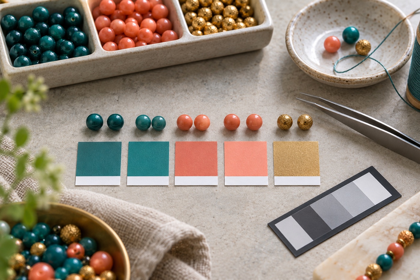
Start with a physical reference
A hex value is a screen instruction, while a bead is a physical object affected by material, finish and light. Take a photo of your candidate beads beside a neutral card in daylight, then compare them directly with the project rather than trusting the screen alone. Put darks, midtones and highlights in separate groups. A warm cream may be a better replacement for a bright digital white if it keeps the surrounding colors coherent. Record the actual brand and color name of each chosen bead.
Compare neighboring colors as a pair
The closest numerical match is not always the best visual match. Put two candidate colors next to the beads that will surround them. If both candidates are similar, choose the one that preserves the contrast of the important edge. For example, a slightly bluer dark shade may separate a subject from its background better than a mathematically closer gray. Make a small two-color swatch before ordering a large quantity, particularly when matching a gradient or a face.
Treat finish and transparency separately
Opaque, translucent, pearl and glitter beads can share a similar printed color name while behaving differently in a finished piece. Keep those finishes in distinct comparison groups. Transparent beads may pick up the color of the surface beneath them; metallic or glossy beads can change appearance with viewing angle. If a design relies on a subtle highlight, test the finish next to the final background rather than checking a loose bead on a white table. The converter can shortlist candidates, but the physical swatch makes the decision.
Keep a substitution log
Save a simple table with the source color, intended manufacturer code if verified, chosen replacement, available quantity, and reason for the choice. Do not present an internal palette index as a confirmed manufacturer SKU. If a supplier changes its catalog, a record of the visible shade and finish will help you find another option. Recalculate per-color quantities after substituting, because merging two close colors means buying one larger bag instead of two small ones.
Check the finished swatch
Build a small sample containing an outline, a large fill and a highlight. Look at it under the lighting in which the finished art will hang or be worn. If the outline loses contrast, revise that pair before working on the full pattern. A good conversion preserves the relationships among colors, not merely the individual swatches. Save a photo of the approved sample alongside the editable project so later revisions use the same material reference.
Continue with BeadArtify
Open the free pattern maker to test your image, continue in the full pattern designer, or browse the original community gallery for color and scale ideas. Your source image is processed locally in the browser.